EARTHEN Music Festival [2020]
Creative Direction, Logo Design, Branding, Merchandising, Campaign and Exhibition Design.
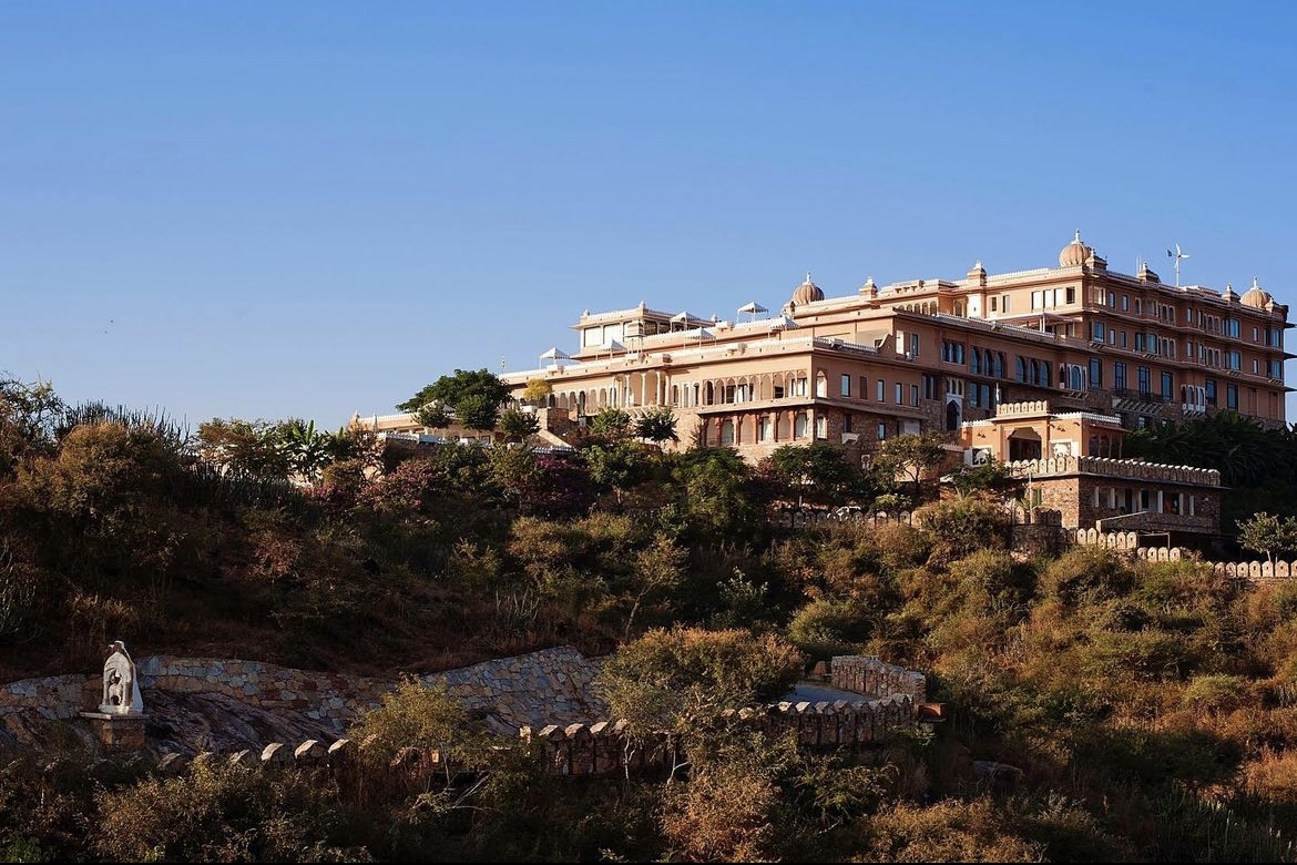
EARTHEN is a Music Festival in India. Their USP is to curate left-field Electronic Music
and audio-visual experiences taking place in Palaces and Forts of India.
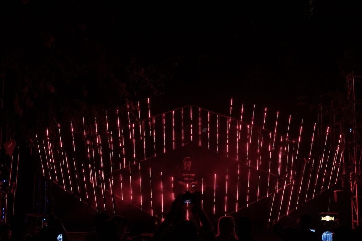
They are pushing the boundaries of mainstream music festivals and experiences through installations,
international lineups mixed with homegrown local talent in exquisite environments.
My responsibilities included designing the overall branding and creative direction of the festival
ranging from naming the festival, logo, brand style guide, posters, social media campaign,
event banners, flags, entry bands, currency notes + cards and many more supporting collaterals and merchandise.
-
2020
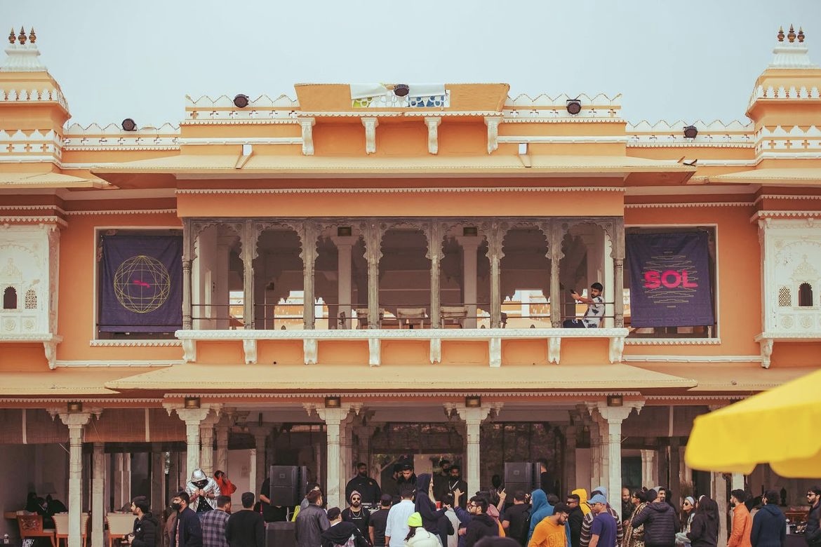
The first edition of EARTHEN was done in collaboration with SOL.

The process started with making a list of keywords & finalising a set to explore further.
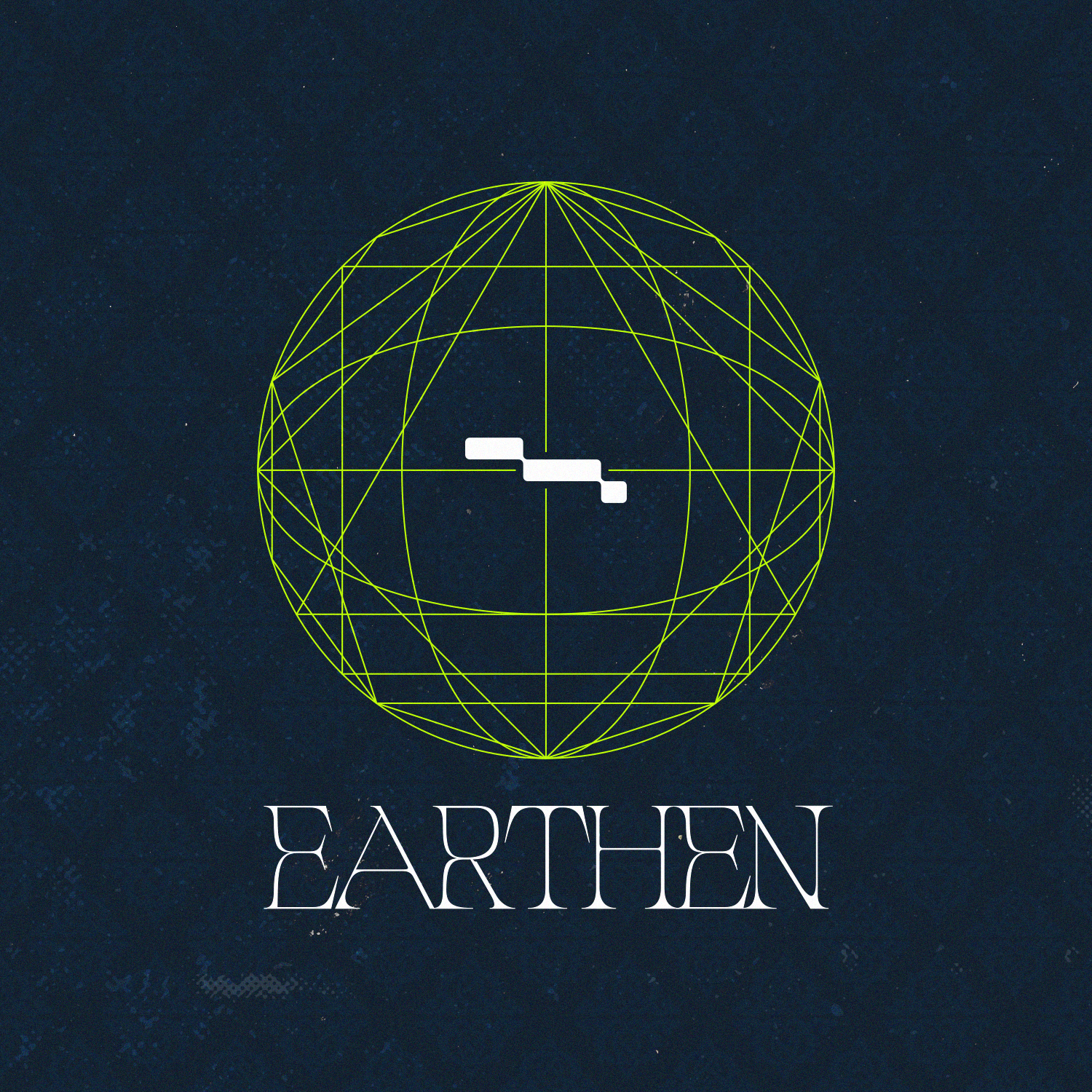
I decided on choosing the word ‘EARTHEN’ as the festival’s name as it reflected on
where the festival positions itself.

As I had little to no material to work with & was not permitted to reveal the location as the festival works on an application
and invite-only process, I made an outline of the 2020 location’s map & chose to develop on the concept further
in the form of an easter egg.
While working on the possible poster iterations for the festival, I began working on the branding for the festival.
I researched on the location’s architecture and philosophy to see the aligning factors between it and EARTHEN.
Features such as Vaastu and the use of elements resonated with the festival’s ethos, developing further on those factors.
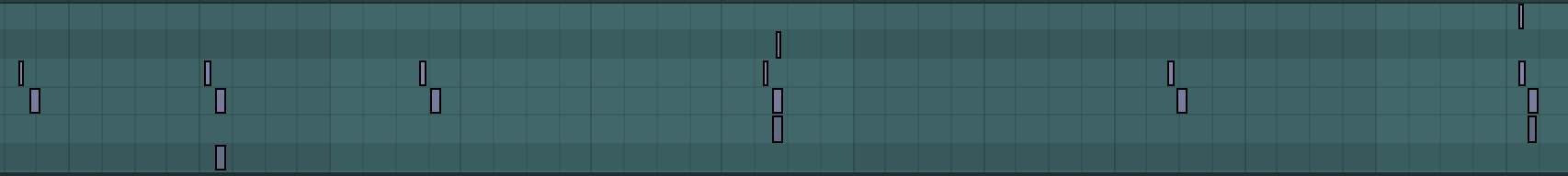


For the logo, I recorded myself, my friend and downloaded audios of different people saying the word ‘EARTHEN.’
Taking those files, I placed them in my DAW, converting them to MIDI - resulting with different melody progressions.
Working on the different progressions and melodies, I came to one that was the closest to the phonetics of the word
and looked aesthetically pleasing at the same time.

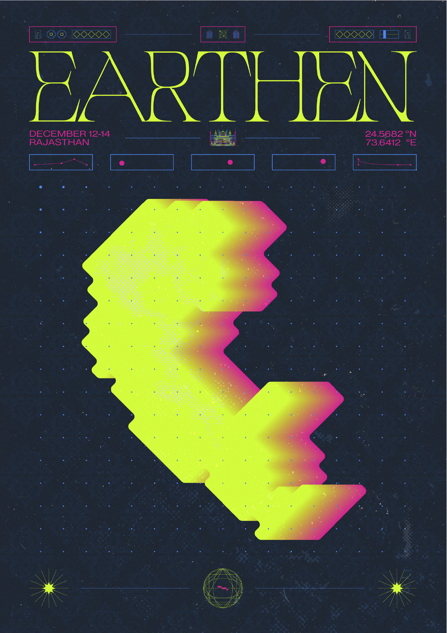
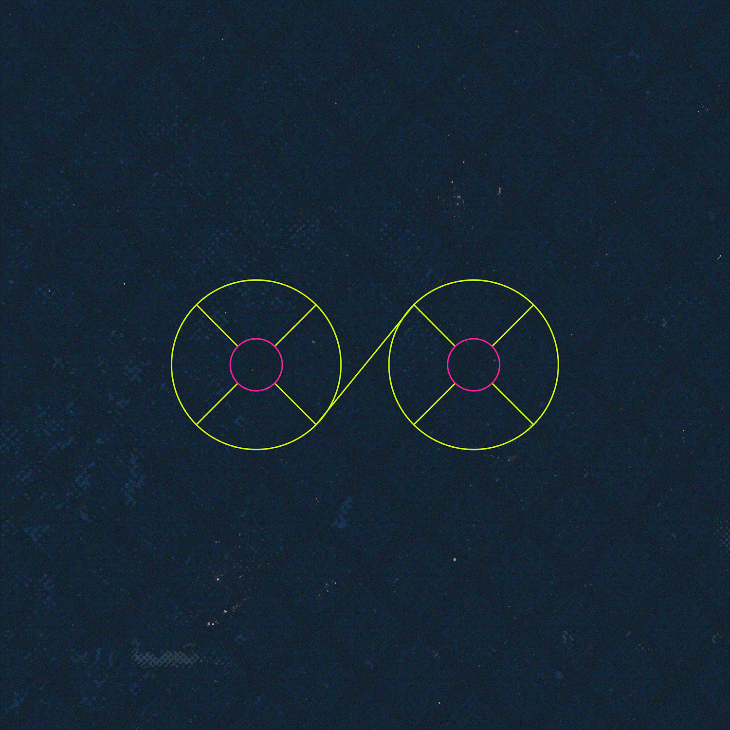
The colour scheme was chosen based on factors such as what the Platonic Solids represent - different elements.
As well as keeping in mind the Left-Field Electronic Music appeal and visibility during night time.
After multiple typographic explorations, logo iterations and keeping the philosophy in mind,
I resulted with the above logo and logotype - fusing the Platonic Solids, longitudes and latitudes
surrounding the visual representation of the word in the form of MIDI.

Main poster showcasing the elements of the festival with subtle hints suggesting the location, vaastu
and Platonic Solids in partnership with SOL.
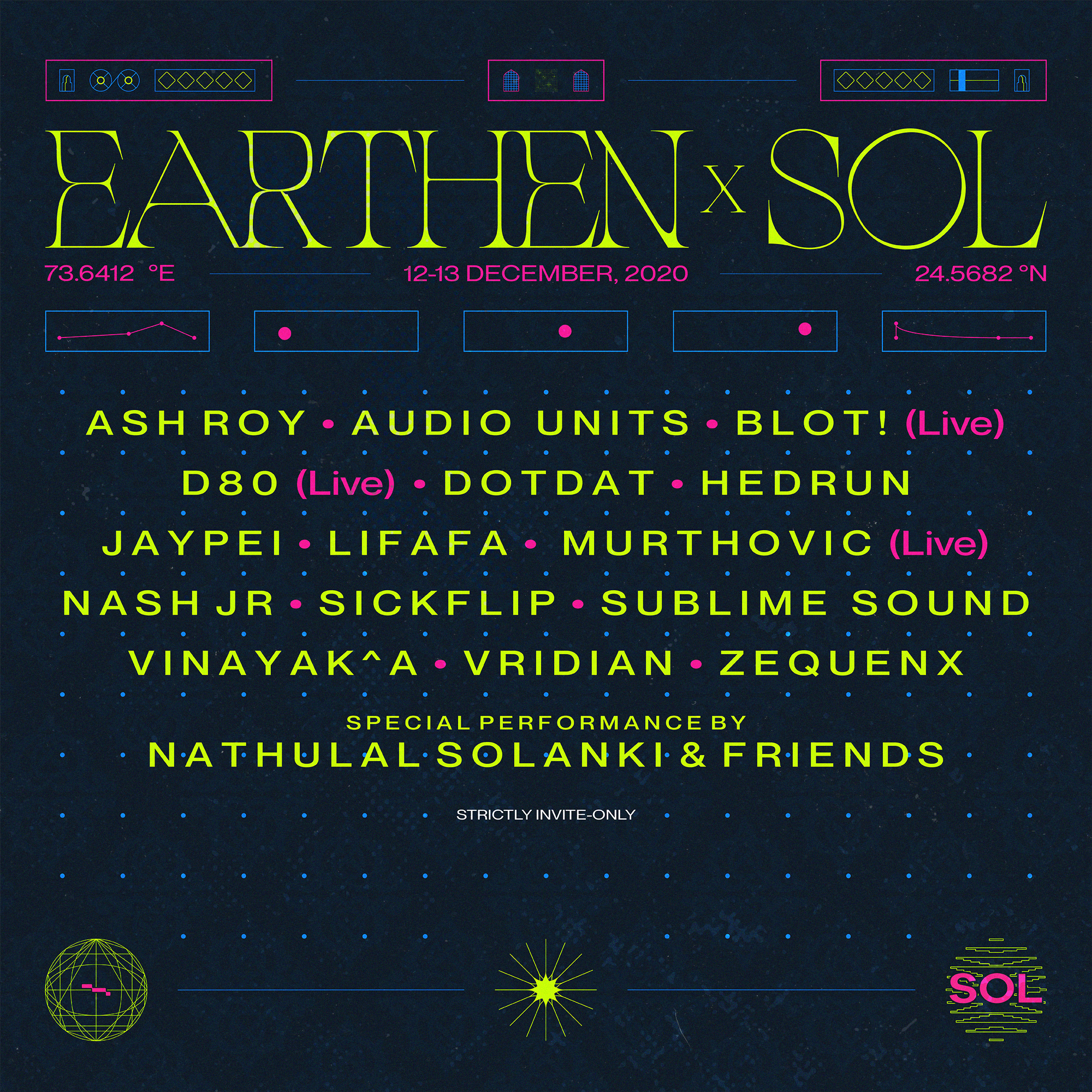
Line-up post for social media.


Social media supporting posts and elements based on the features of the location and festival.
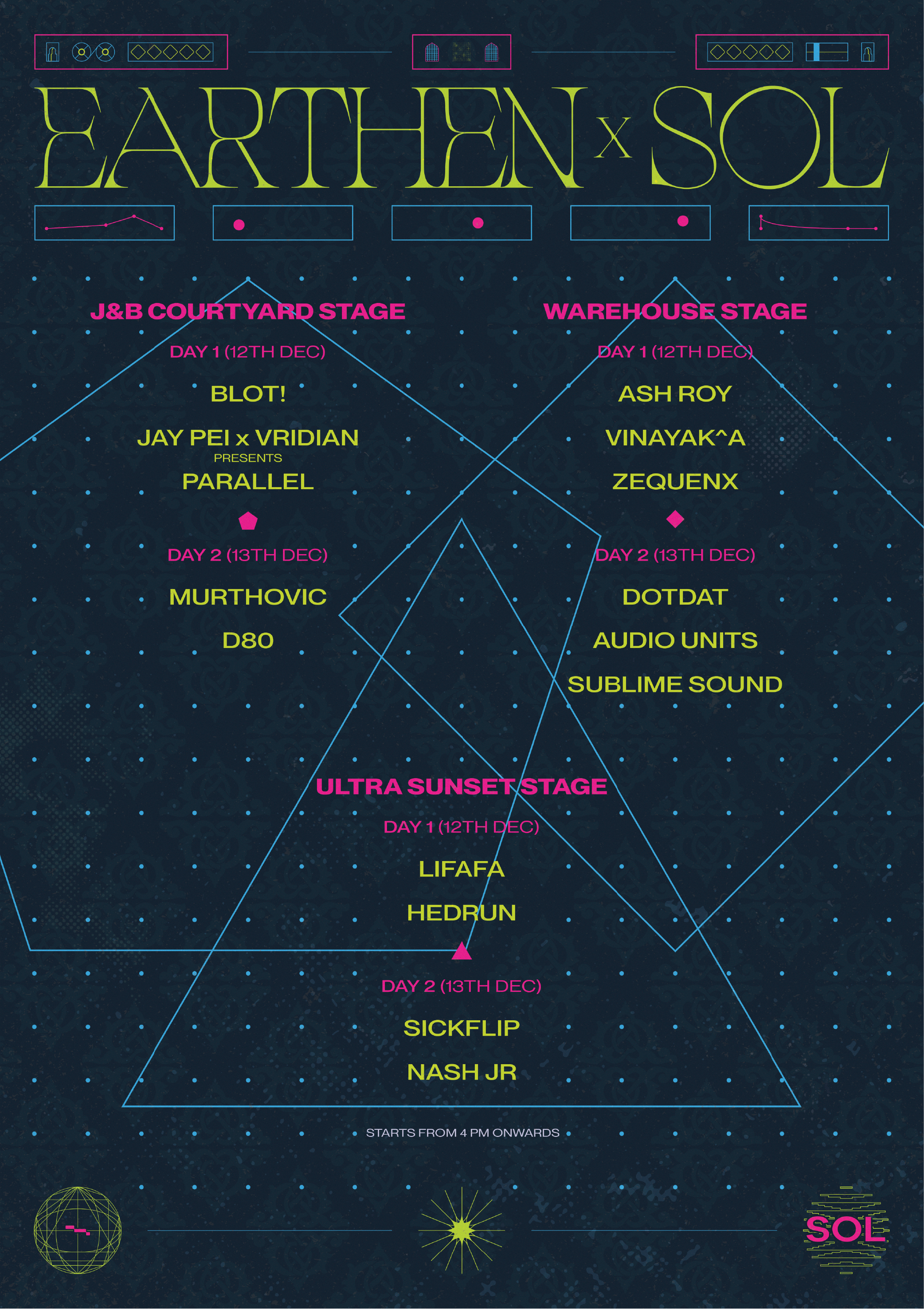
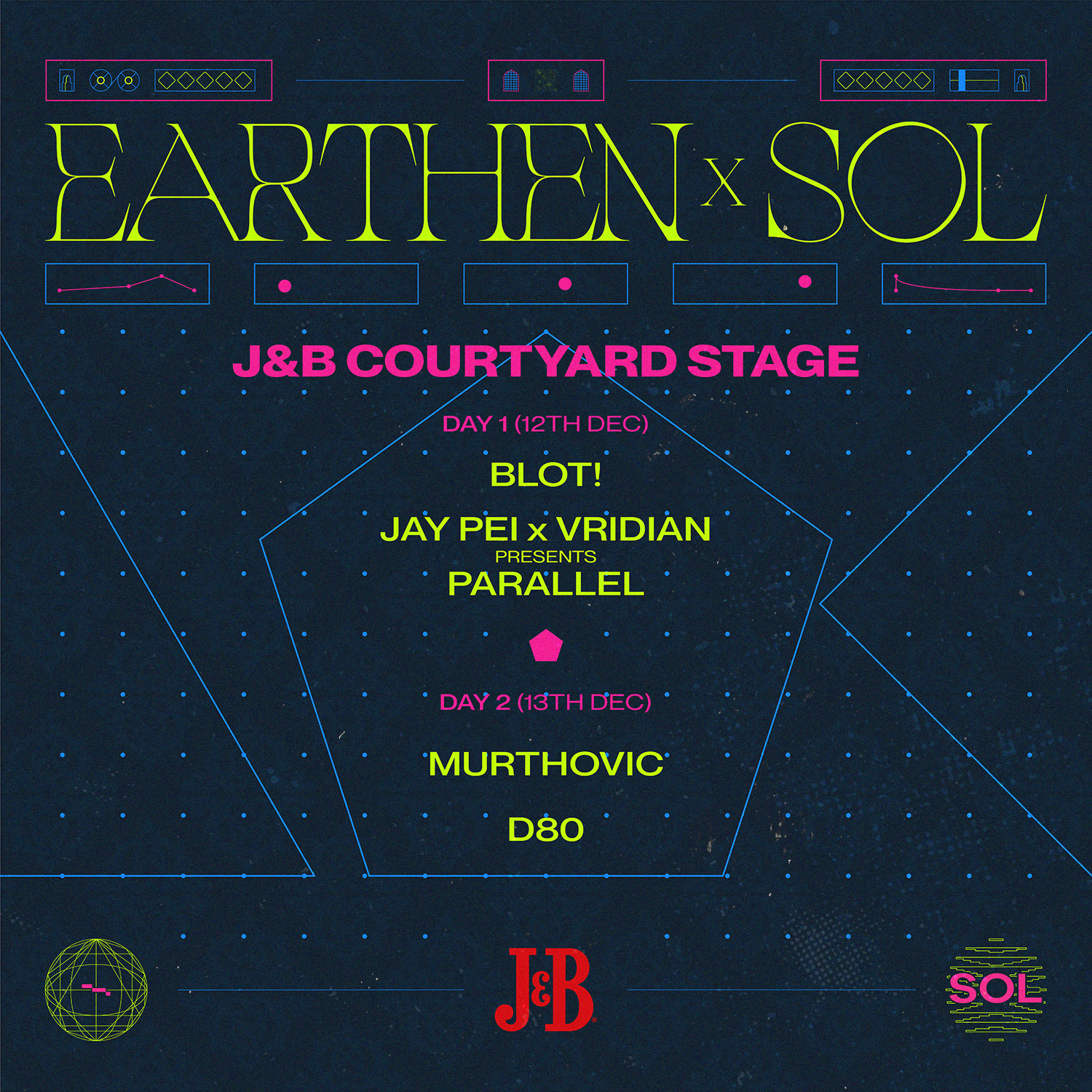
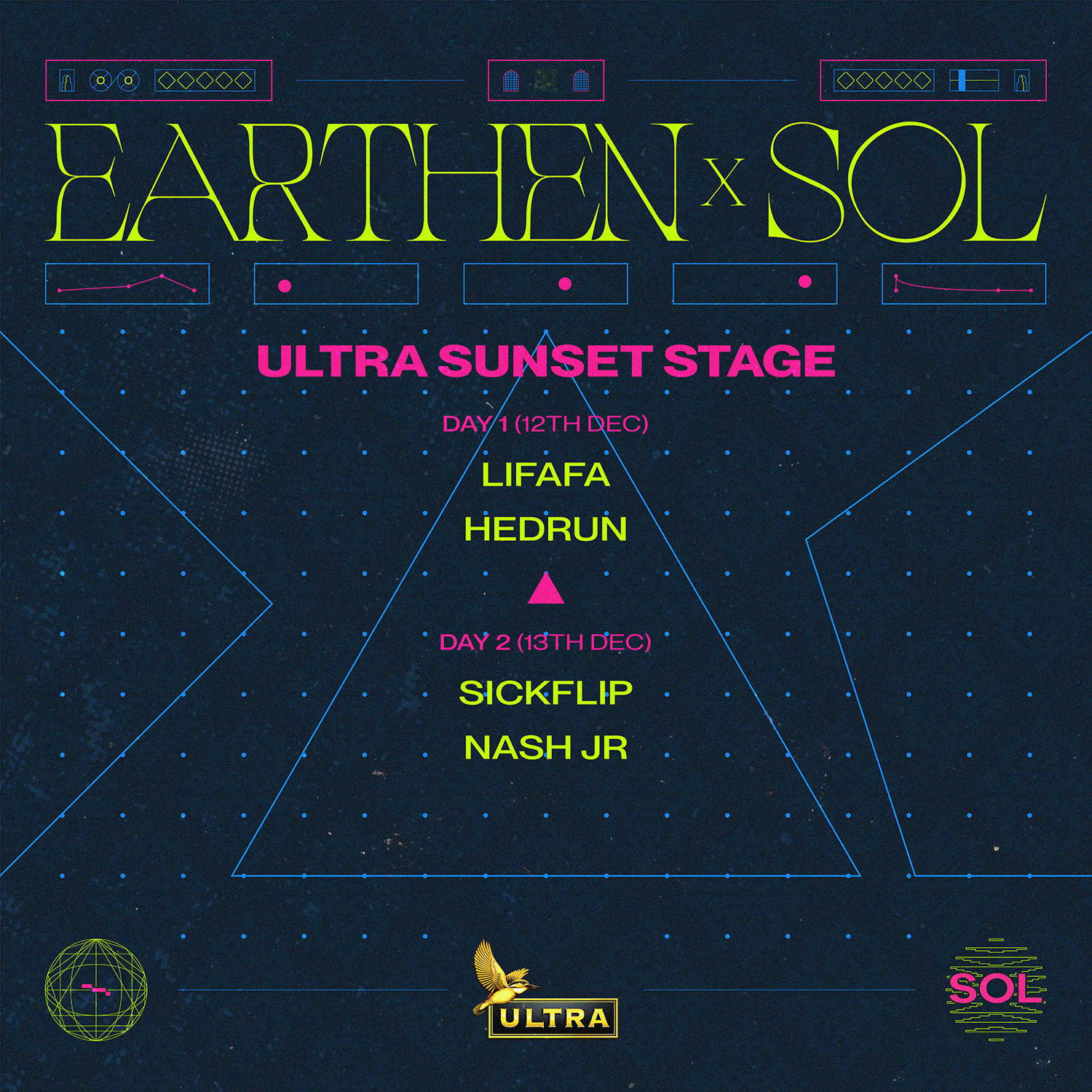
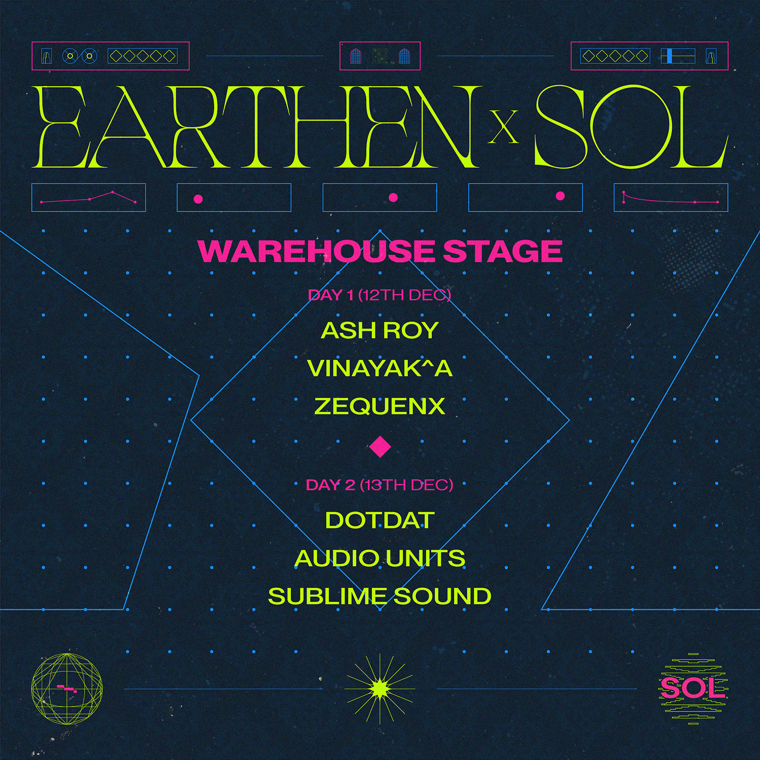
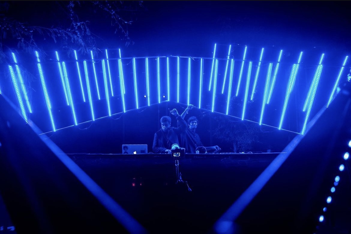
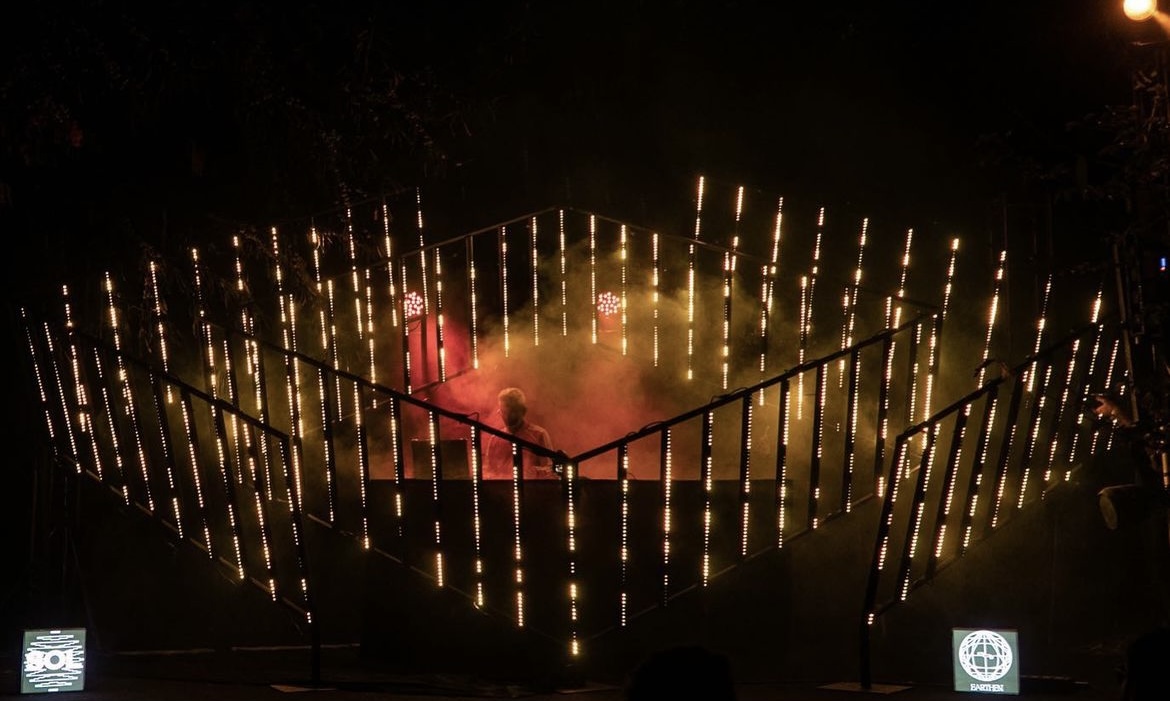
Stage line-ups reflecting the Platonic Elements based on the Vaastu of the location


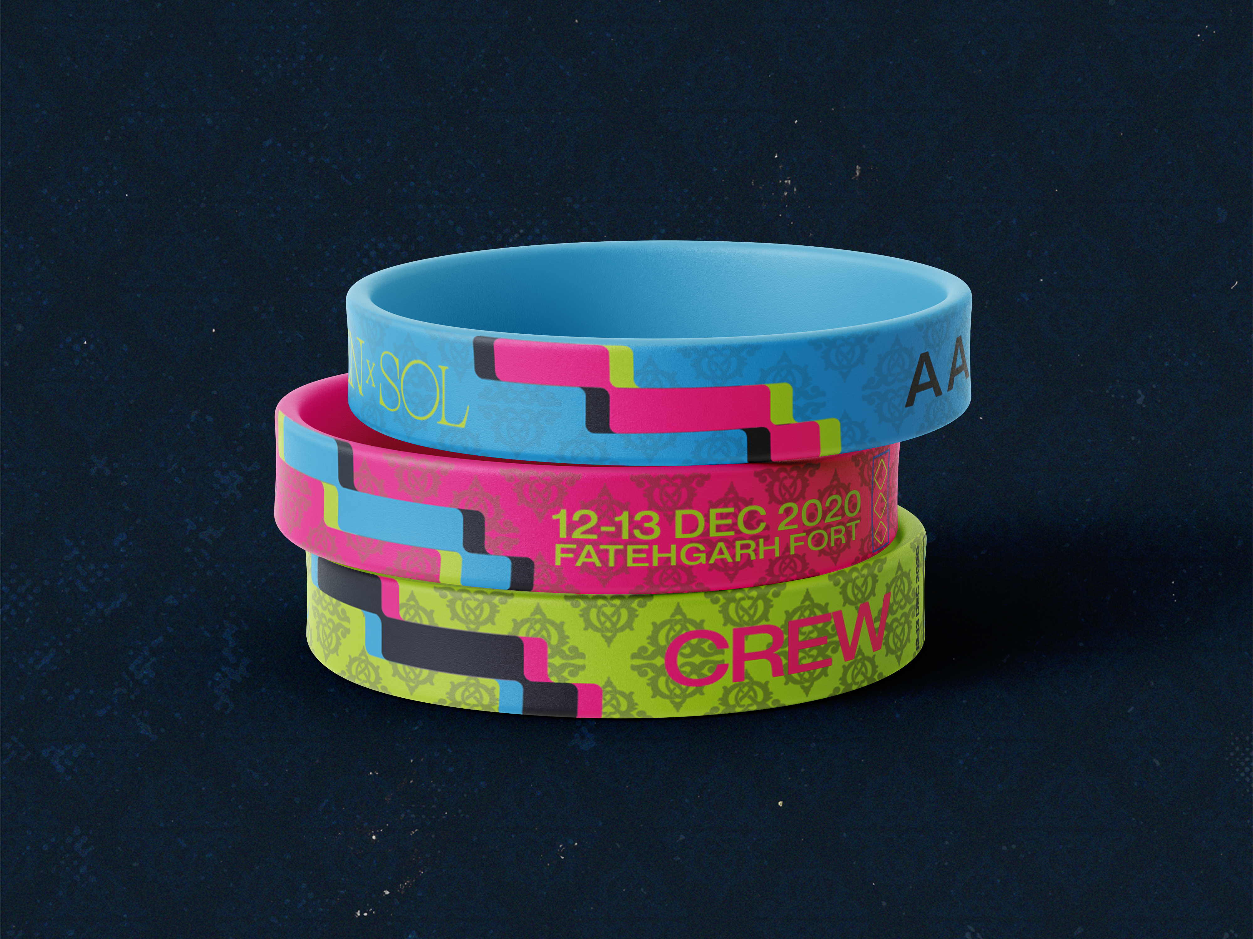
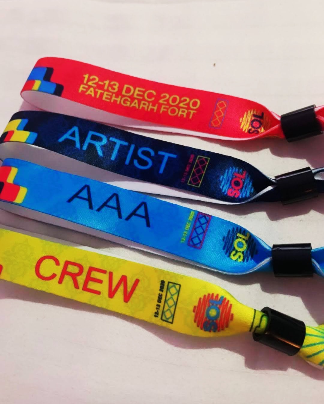

Wristbands for the general admission, artists, crew & AAA.
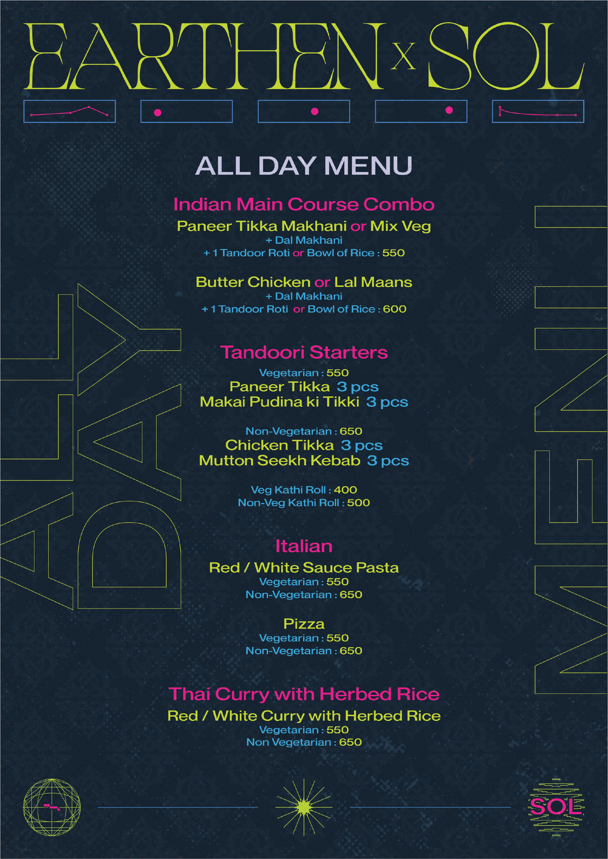

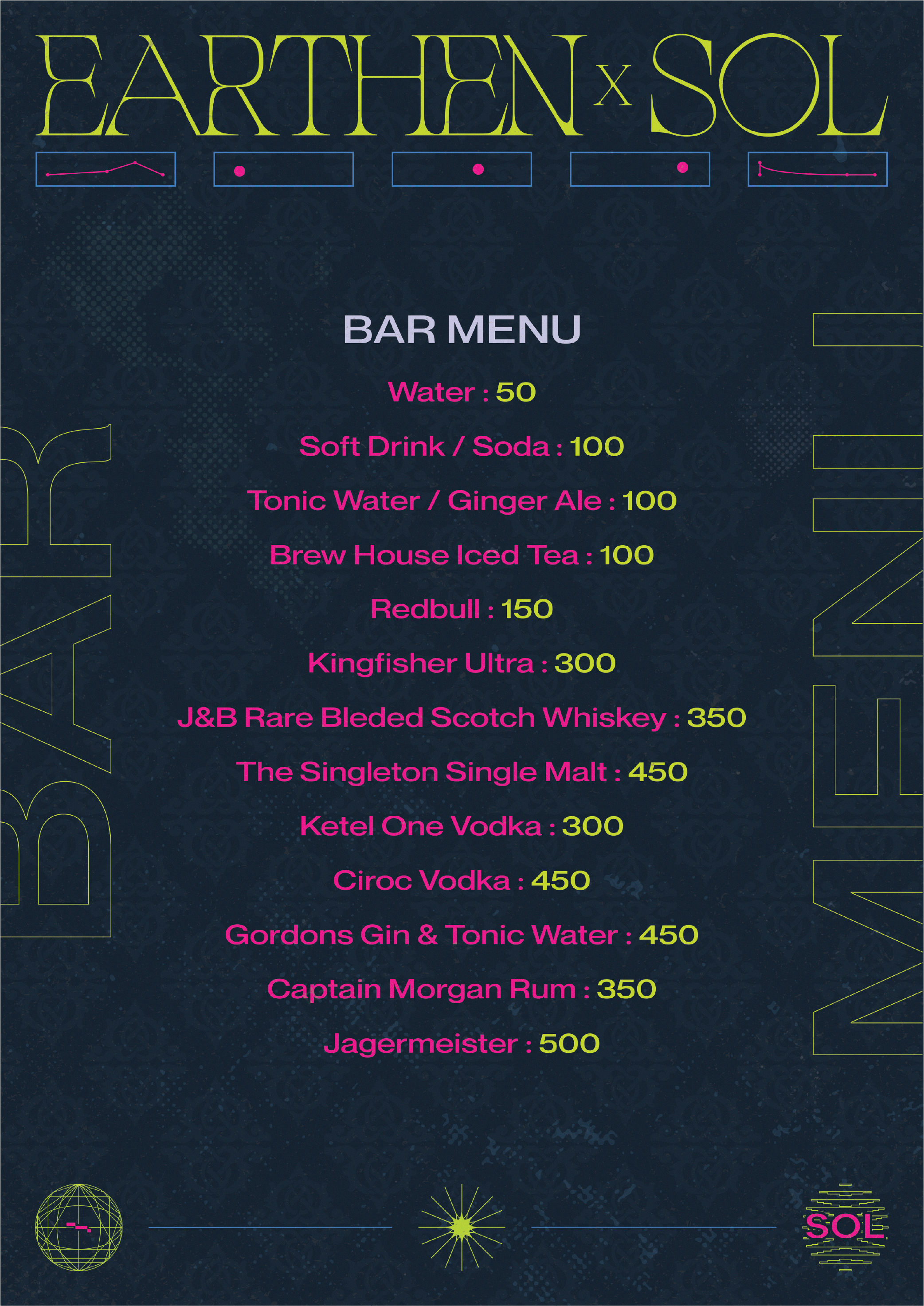
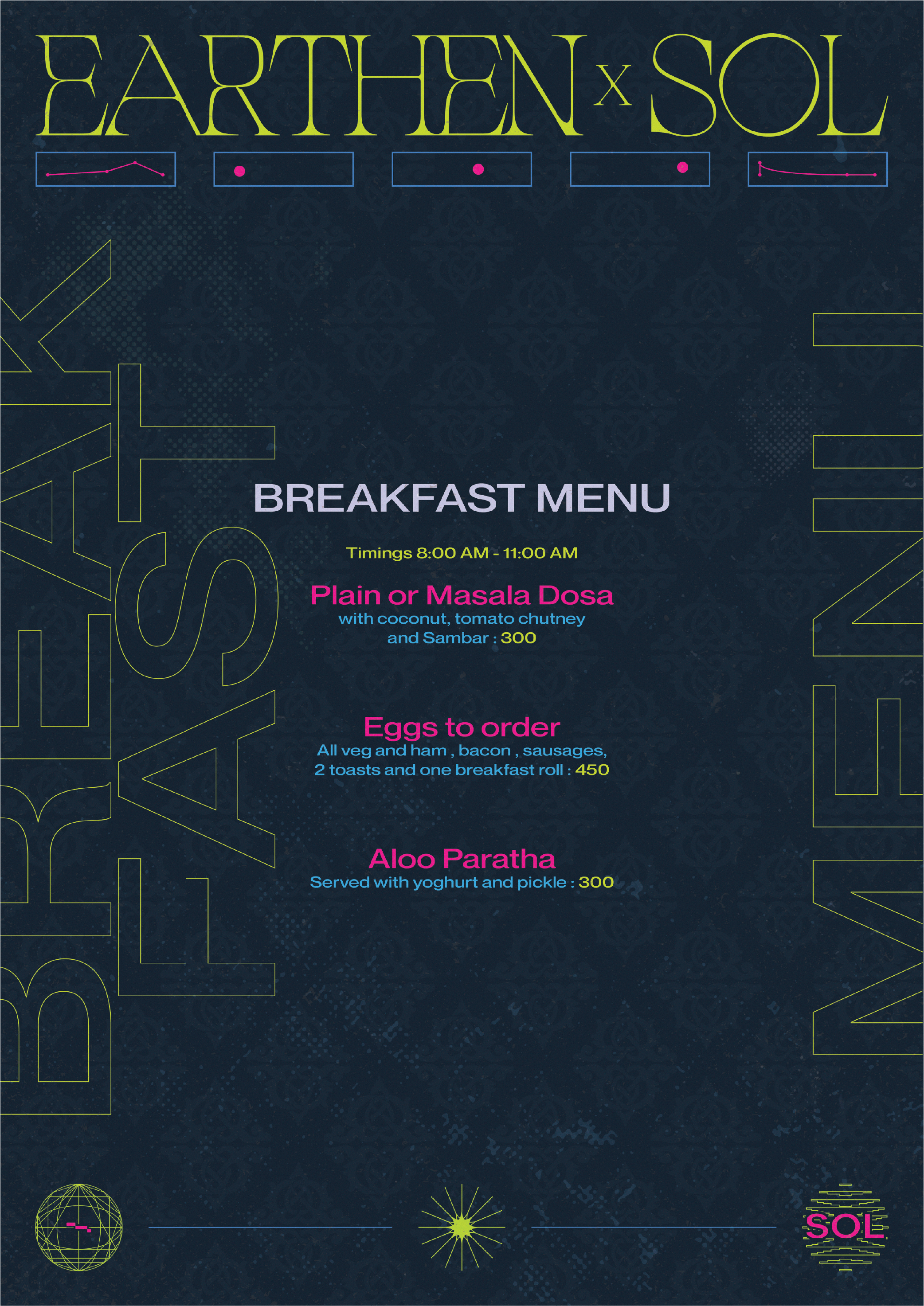

Menus designed for the festival.
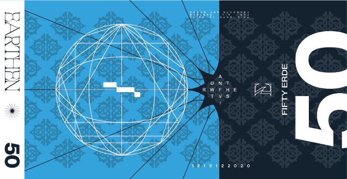


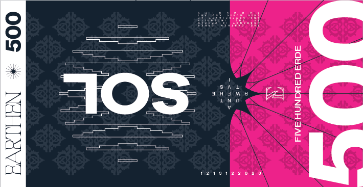
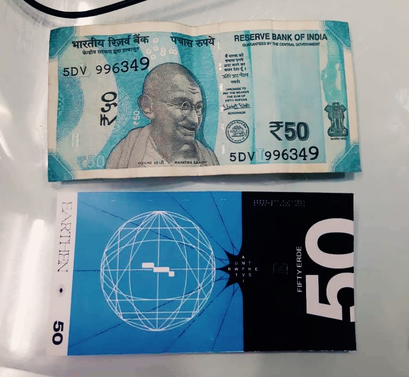
Currency notes front and back designed for the festival transactions.
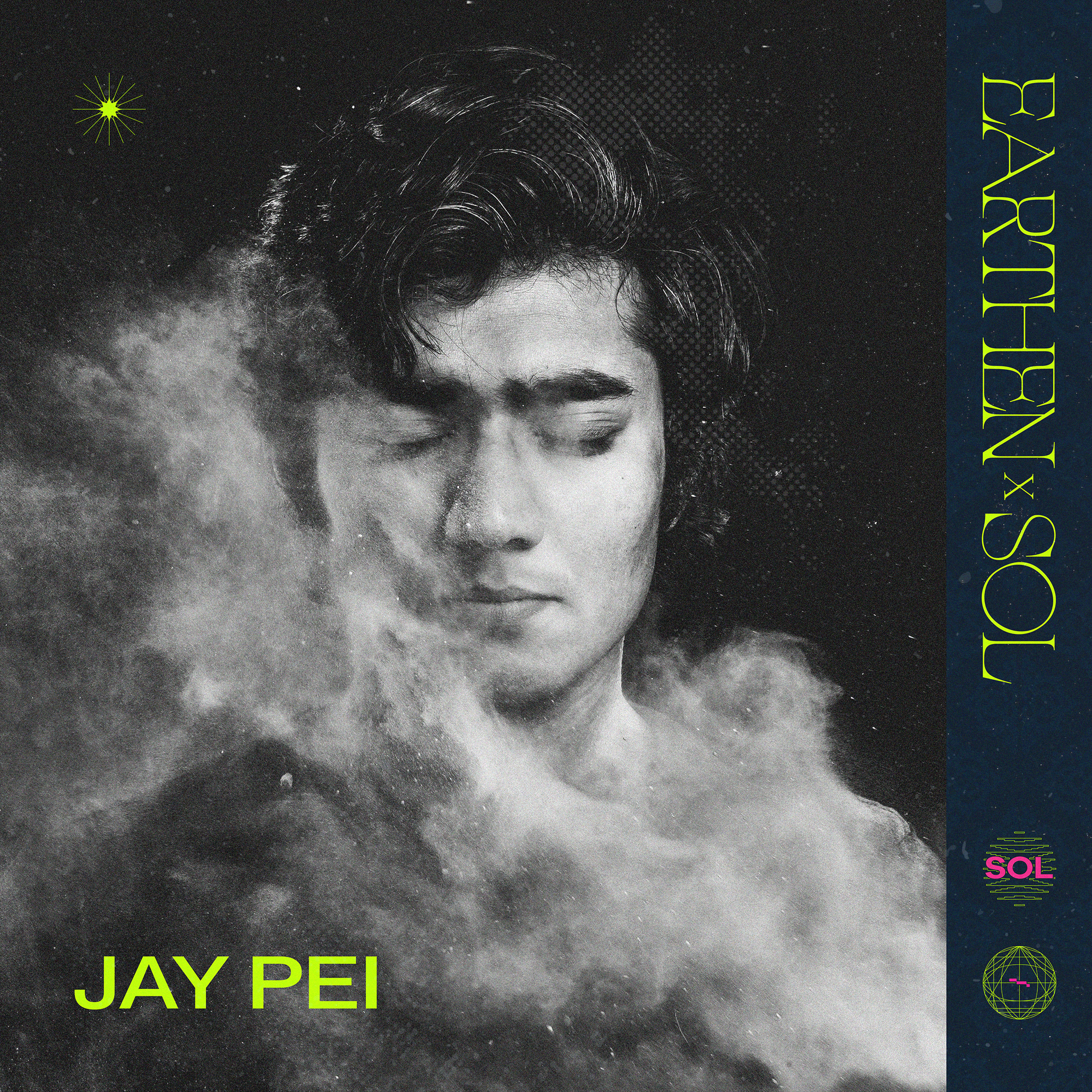
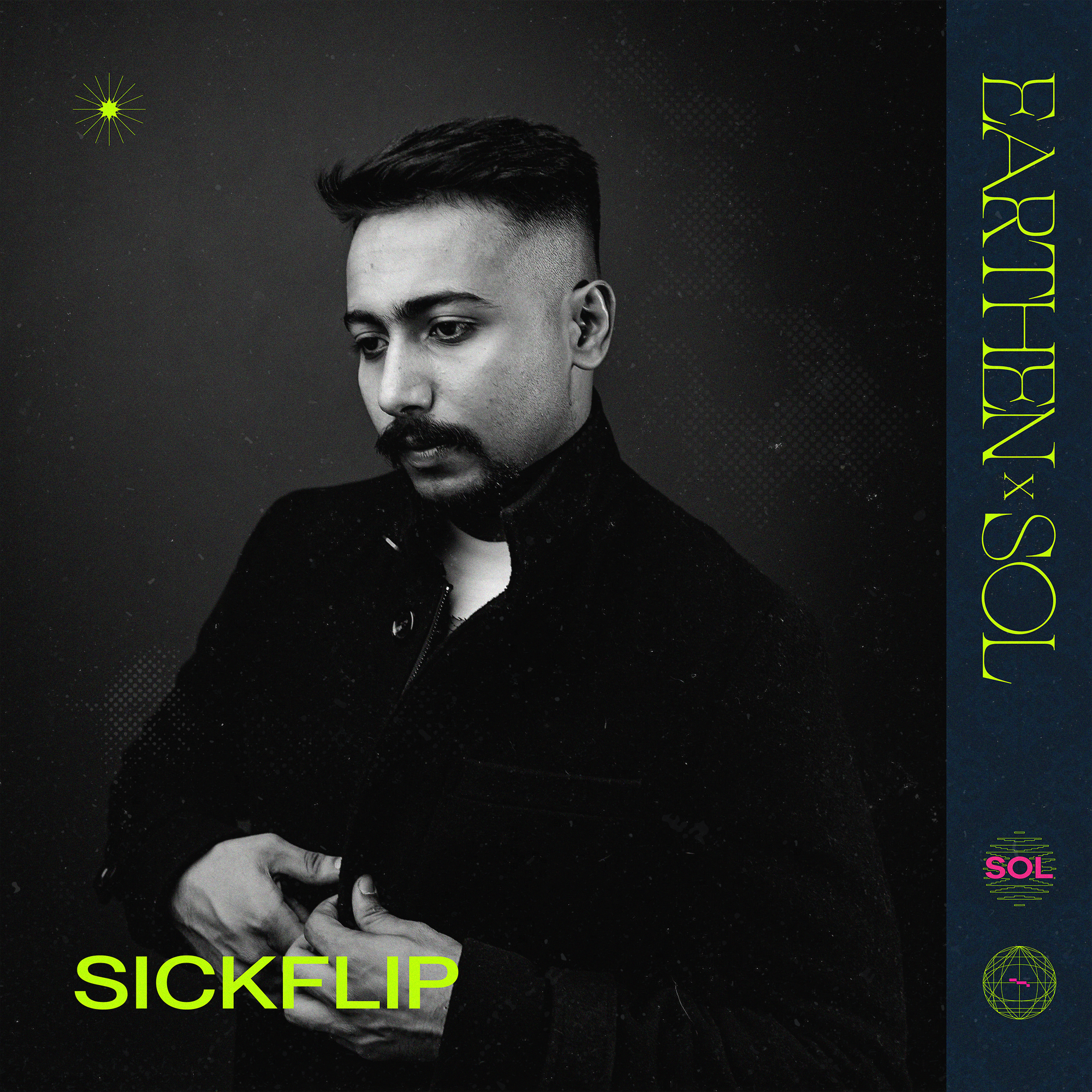
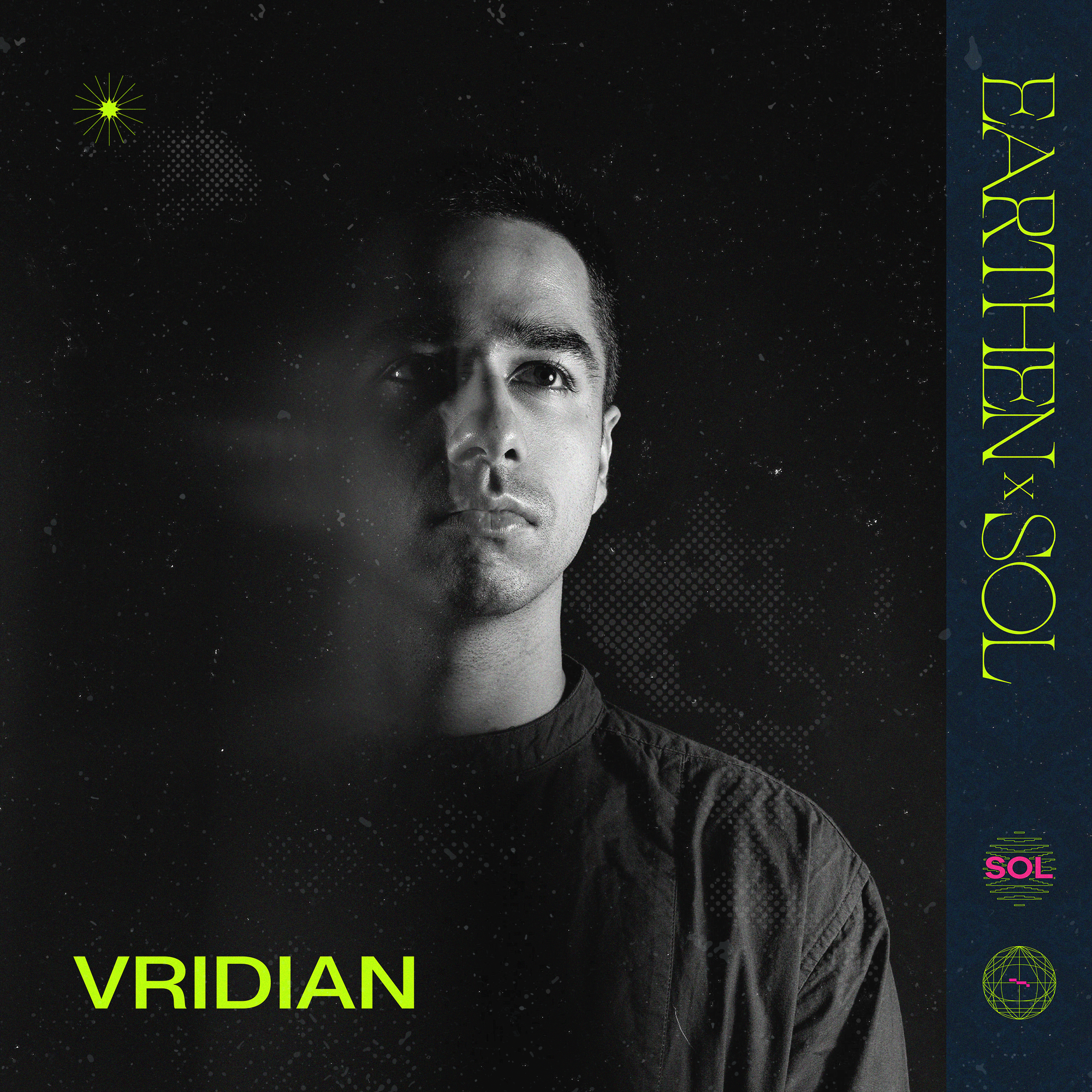
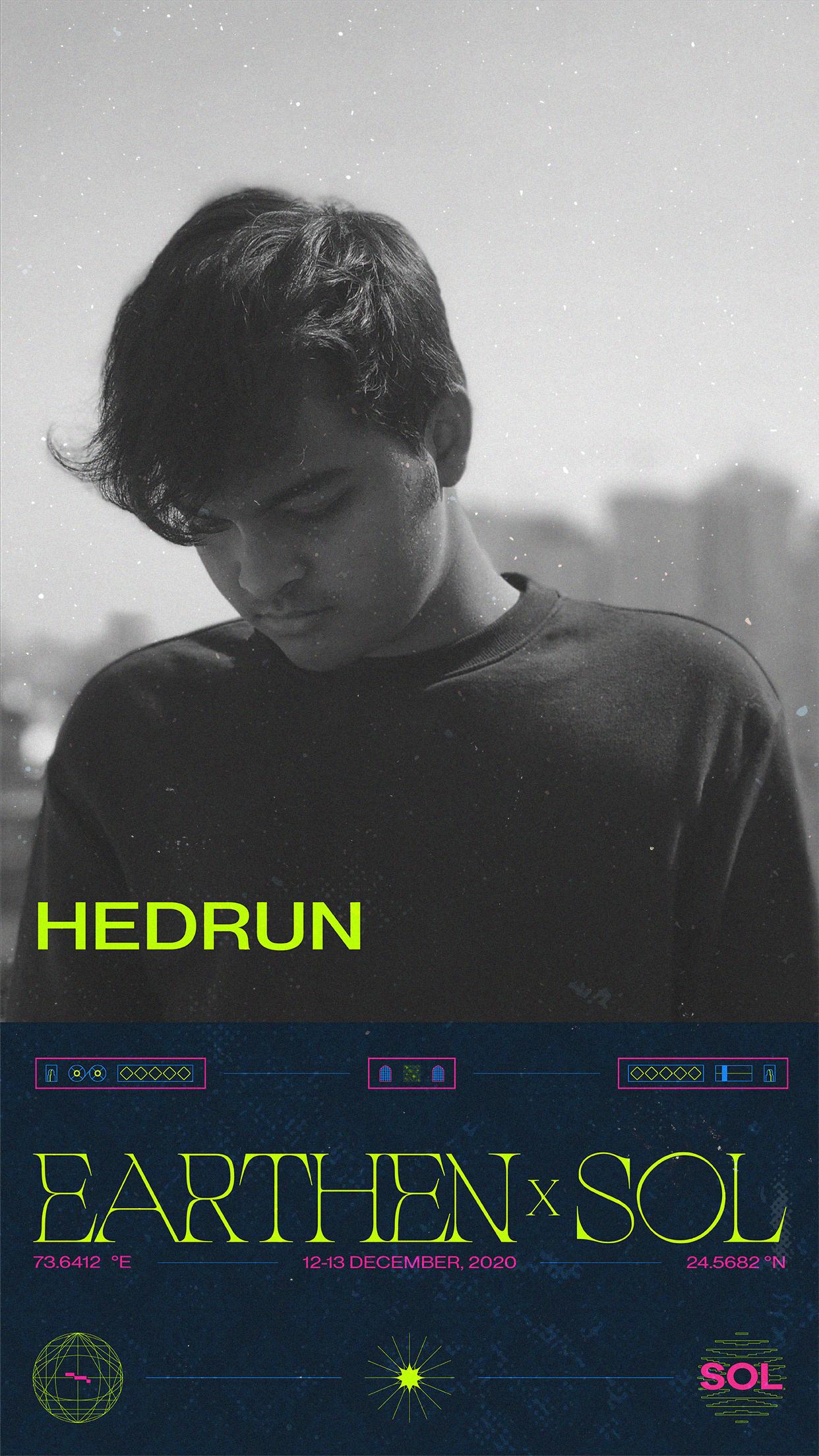
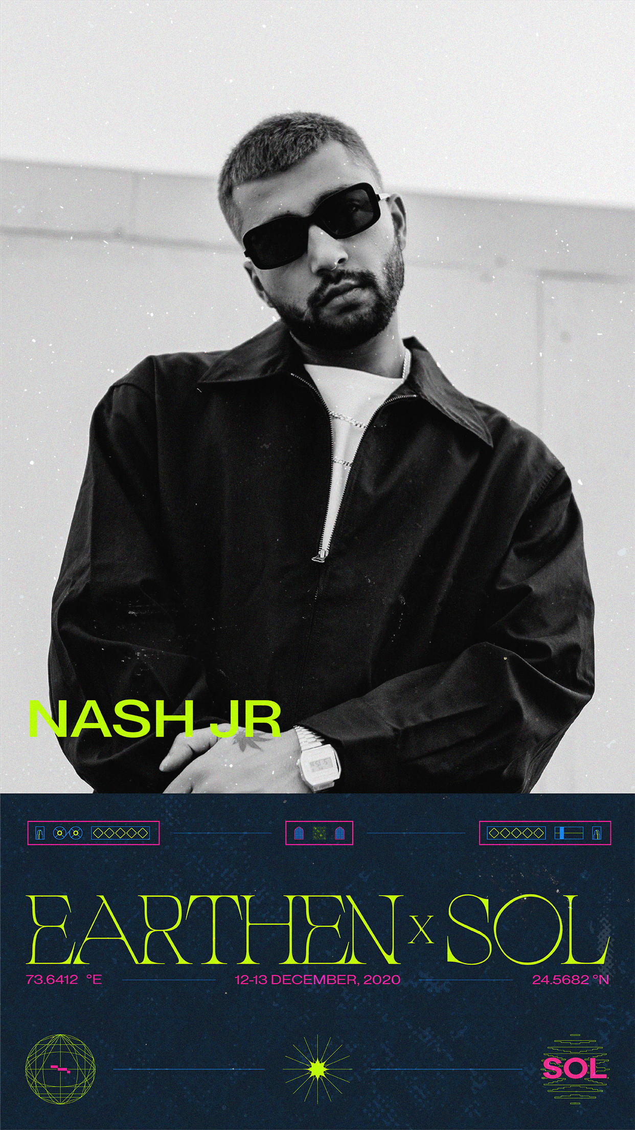
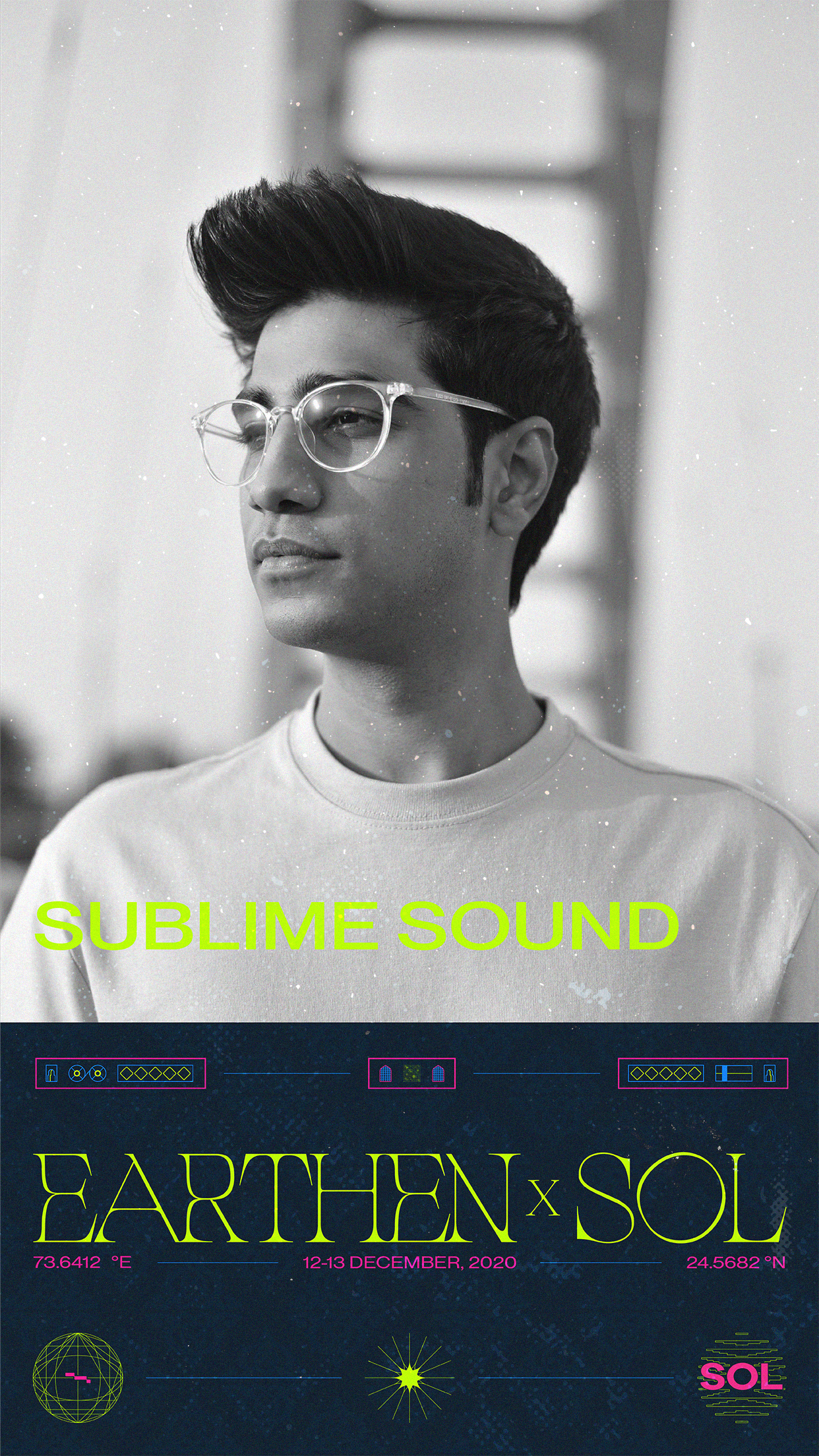
Artist posts & stories for Instagram.


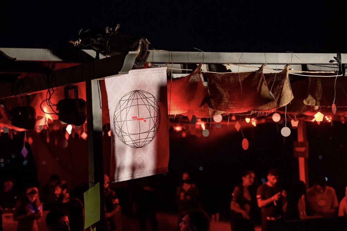
Flags representing the different elements of the Platonic Solids along with the branding of the festival.
-
2020
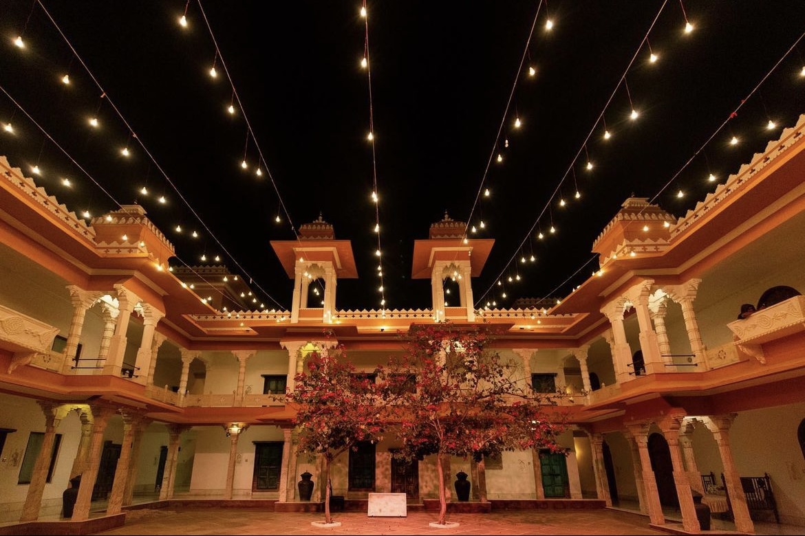
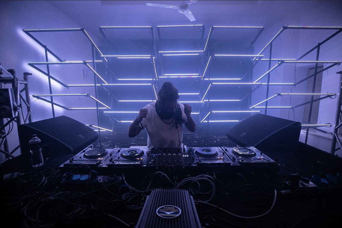
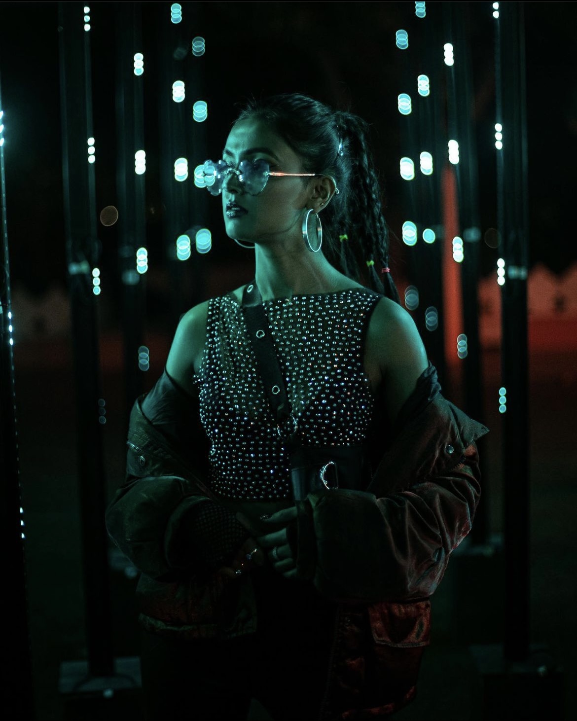
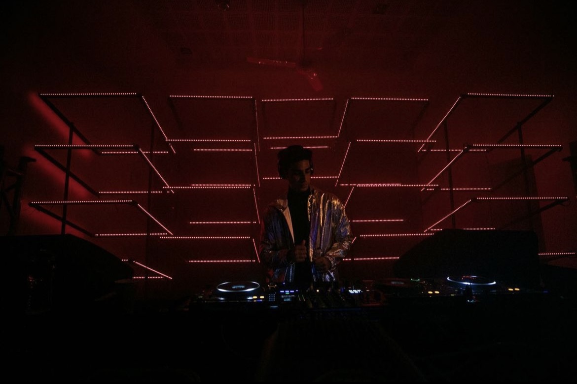
Images taken from EARTHEN’s Instagram.